Note
Access to this page requires authorization. You can try signing in or changing directories.
Access to this page requires authorization. You can try changing directories.
Configuring your company branding for the user sign-in process provides a seamless experience in your applications that use Microsoft Entra ID as the identity and access management service. Use this CSS reference guide if you're using the CSS template as part of the customize company branding process.
Important
Tenants created after January 5, 2026 don't have custom CSS available for company branding in Microsoft Entra ID. Tenants created before January 5, 2026, can continue to use custom CSS.
Microsoft Entra External ID tenants aren't affected.
Deprecation of custom CSS positioning properties
As part of the Microsoft Secure Future Initiative, Microsoft Entra ID is retiring support for custom CSS positioning properties in company branding. These properties control where elements appear on the sign-in page and how they're layered, sized, and displayed. For example, they can move, overlap, resize, or hide page content. Retiring them keeps sign-in page layouts consistent and predictable across Microsoft Entra ID.
This change is the first step toward retiring the custom CSS feature entirely. Microsoft plans to provide advance notice, recommended migration paths, and future advanced customization options before that retirement.
For more information, see the blog post Microsoft Entra ID enhances security of branded sign-ins.
Timeline
- After July 21, 2026: Tenants that don't already use the affected positioning properties can't configure them.
- Later: The affected positioning properties will be deprecated globally. After deprecation, these properties are blocked and no longer function.
- Eventually: Custom CSS will be fully retired. Microsoft will share more guidance, including recommended migration paths, before retirement.
Who's affected
This change affects organizations whose Microsoft Entra ID tenant uses any of the deprecated positioning properties in their custom CSS. Microsoft Entra External ID tenants aren't affected. Tenants that don't already use these properties aren't affected, because they can't configure the properties after July 21, 2026.
Microsoft notifies affected customers directly in advance.
Deprecated properties
If your custom CSS uses any of the following properties, remove them from your configuration. These properties don't have a supported migration or replacement.
position(includingtop,right,bottom,left, andz-index)margin(includingmargin-top,margin-bottom,margin-left, andmargin-right)transformtranslateopacityoverflowfilterpointer-eventsclip-pathmix-blend-mode
Check and update your custom CSS
To check whether your custom CSS uses any deprecated properties, use Microsoft Graph to export your current company branding configuration, and then check it with the tenant branding inspector tool. You need a Global Administrator or Branding Administrator account.
Go to Microsoft Graph Explorer, and then sign in to your tenant.
If you don't already know your tenant ID, send a
GETrequest to the following URL, and then copy theidvalue from the response:https://graph.microsoft.com/v1.0/organizationSend a
GETrequest to the following URL to return all configured company branding localizations. Replace<tenant-id>with your tenant ID:https://graph.microsoft.com/v1.0/organization/<tenant-id>/branding/localizationsCopy the response, or export it to a JSON file.
Go to the tenant branding inspector tool.
Paste the copied response, or upload the exported JSON file, into the tool. The tool lists each locale and the deprecated properties that it uses.
To remove the deprecated properties, edit your CSS file, upload it on the Company Branding page in the Microsoft Entra admin center, and then save your changes. To validate the visual impact before you update production, apply the changes in a test tenant first.
HTML selectors
The following CSS styles become the default body and link styles for the whole page. Styles that you apply to other links or text override these selectors.
body- Styles for the whole page- Styles for links:
a, a:link- All linksa:hover- When the mouse is over the linka:focus- When the link has focusa:focus:hover- When the link has focus and the mouse is over the linka:active- When the link is being clicked
Microsoft Entra CSS selectors
Use the following CSS selectors to configure the details of the sign-in experience.
Note
To customize internal navigation links, use the new custom CSS selector: .ext-link.
.ext-background-image- Container that includes the background image in the default lightbox template.ext-header- Header at the top of the container.ext-header-logo- Header logo at the top of the container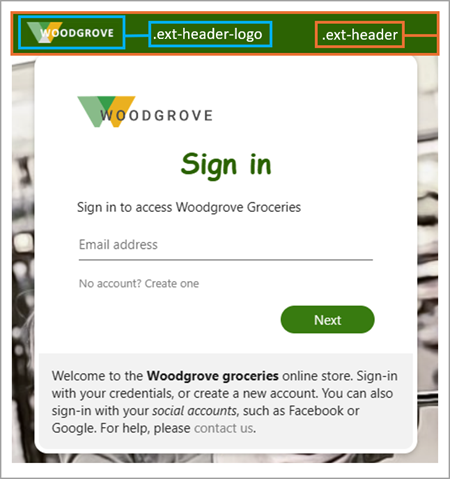
.ext-middle- Style for the full-screen background that aligns the sign-in box vertically to the middle and horizontally to the center.ext-vertical-split-main-section- Style for the container of the partial-screen background in the vertical split template that contains both a sign-in box and a background (This style is also known as the Active Directory Federation Services (ADFS) template.).ext-vertical-split-background-image-container- Sign-in box background in the vertical split/ADFS template.ext-sign-in-box- Sign-in box container.ext-title- Title text
.ext-subtitle- Subtitle textStyles for links:
.ext-link- Internal navigation links
Styles for primary buttons:
.ext-button.ext-primary- Primary button default style.ext-button.ext-primary:hover- When the mouse is over the button.ext-button.ext-primary:focus- When the button has focus.ext-button.ext-primary:focus:hover- When the button has focus and the mouse is over the button.ext-button.ext-primary:active- When the button is being clicked

Styles for secondary buttons:
.ext-button.ext-secondary- Secondary buttons.ext-button.ext-secondary:hover- When the mouse is over the button.ext-button.ext-secondary:focus- When the button has focus.ext-button.ext-secondary:focus:hover- When the button has focus and the mouse is over the button.ext-button.ext-secondary:active- When the button is being clicked

.ext-error- Error text
Styles for text boxes:
.ext-input.ext-text-box- Text boxes.ext-input.ext-text-box.ext-has-error- When there's a validation error associated with the text box.ext-input.ext-text-box:hover- When the mouse is over the text box.ext-input.ext-text-box:focus- When the text box has focus.ext-input.ext-text-box:focus:hover- When the text box has focus and the mouse is over the text box

.ext-boilerplate-text- Custom message text at the bottom of the sign-in box.ext-promoted-fed-cred-box- Sign-in options text box
Styles for the footer:
.ext-footer- Footer area at the bottom of the page.ext-footer-links- Links area in the footer at the bottom of the page.ext-footer-item- Link items (such as "Terms of use" or "Privacy & cookies") in the footer at the bottom of the page.ext-debug-item- Debug details ellipsis in the footer at the bottom of the page